CSS Modern Responsive Web Design Create 5 Different Sites
Why take this course?
Master CSS Modern Responsive Web Design: Create 5 Different Sites! 🚀
Course Instructor: Laurence Svekis
Course Title: CSS Modern Responsive Web Design: Create 5 Different Sites
Course Headline:
🌟 Elevate Your Web Design Skills with Cutting-Edge Techniques! 🌟
Course Description:
Build YOUR Portfolio with CSS Grid, FlexBox & Floats + Responsive Design 🖥️✨
Are you ready to take your web design skills to the next level? Dive into the world of modern responsive design by creating 5 Different MODERN Fully Responsive Mobile Ready websites using CSS Grid, Flexbox, and Floats. This course is a treasure trove for anyone eager to expand their portfolio with unique and diverse website designs. 🎨
What You'll Learn:
- Creating Websites with CSS Float ☰
- Designing with Flexbox CSS 🌀
- Mastering Websites using CSS Grid 🧝♂️
- Mobile First Design Approach 📱
- Building Full Responsive Mobile Ready NavBars 🔄
Course Highlights:
-
Uniquely Designed Websites: Each website is crafted to offer a distinct design experience, ensuring you're exposed to a wide range of styles and techniques.
-
Learn From Scratch: This course starts with the basics and builds up to complex layouts, perfect for beginners and intermediate web designers.
-
All New Content: The designs and methods taught in this course are exclusive to this product, providing you with fresh, innovative approaches to modern web design.
Your Portfolio Projects:
Website #1: CSS Float Site 🏗️
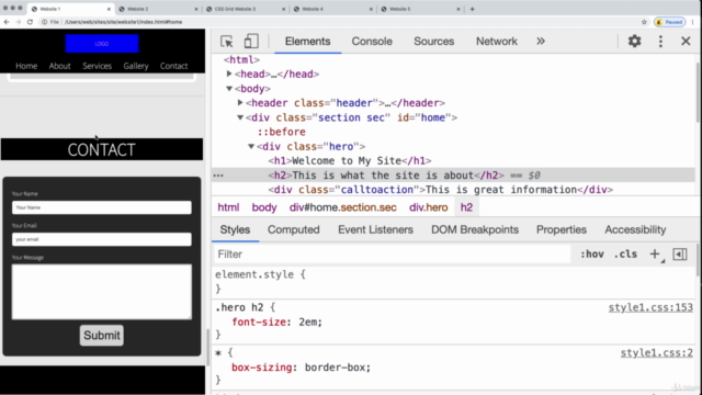
A mobile-ready, single-page design with a sticky nav header and responsive mobile menu. Learn to create a custom contact form with a mailto function and discover top resources for placeholder content.
Website #2: Single Page Modern Flexbox Website 🎨
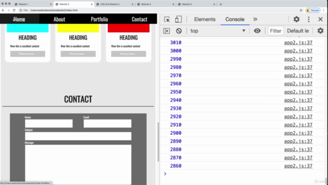
Explore the power of Flexbox with a single-page, modern design featuring an auto-scrolling JavaScript scroller. You'll also reuse CSS components to create cards and other elements for efficiency.
Website #3: CSS Grid Responsive Design 🔁
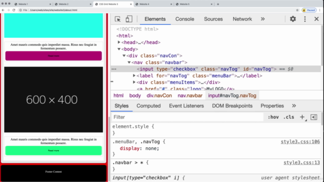
Develop a website using CSS Grid, complete with a responsive, collapsible navbar, and learn how to make images adaptable across devices. This project will guide you through creating different page designs using CSS Grid, ensuring your site is both visually appealing and functionally robust.
Website #4: Floats & Grid with Columns 📐
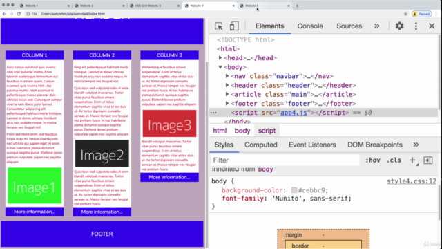
Combine modern navigation bar design with a grid structure to create a flexible, responsive website. This project includes using FontAwesome and other top online tools for enhanced functionality and aesthetics.
Website #5: Flexbox Complex Menu Website 🌐
This complex menu website will teach you how to create a dynamic, responsive navbar with submenu items using JavaScript. Enhance your design skills with this project, which emphasizes responsive images and interactive elements for a seamless user experience.
Join Now and Transform Your Web Design Skills! 🎓🎉
Enroll in our CSS Modern Responsive Web Design course today and take the first step towards becoming a proficient web designer. With hands-on projects and expert guidance, you'll create an impressive portfolio that showcases your ability to design websites for any screen size. Let's build something extraordinary together! 🛠️🚀
Note: This course is designed to provide both beginners and intermediate web designers with a comprehensive understanding of modern responsive design techniques using CSS Grid, Flexbox, and Floats. By the end of this course, you'll have an expanded skill set and a portfolio filled with diverse, responsive website designs. 🖌️💻
Course Gallery
Loading charts...