Data Analytics: Python Visualizations
Enrich Data Science, ML and Analytics with powerful Visualisations using Matplatlib, Seaborn and Bokeh
4.53 (36 reviews)

606
students
6.5 hours
content
Jul 2021
last update
$19.99
regular price
Why take this course?
🎉 Course Headline: Data Analytics: Python Visualizations
🚀 Course Description:
Are you ready to elevate your Data Science, Machine Learning (ML) projects, or Business Analysis capabilities with stunning and insightful visualizations? Look no further! "Data Analytics: Python Visualizations" course is the comprehensive guide you've been searching for. 📊🔍
Why This Course?
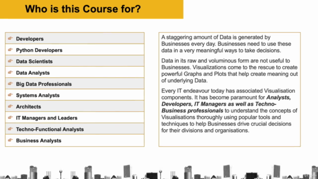
- For Data Scientists & ML Enthusiasts: Dive into the world of data visualization to extract meaningful patterns and insights from your datasets.
- For Business & Functional Analysts: Learn to present complex data in a way that tells a story, influencing decisions with clarity and impact.
- For Aspiring Data Analysts: Gain hands-on experience with real-life scenarios and raw data to master the art of Exploratory Data Analysis (EDA).
🎓 What You Will Learn:
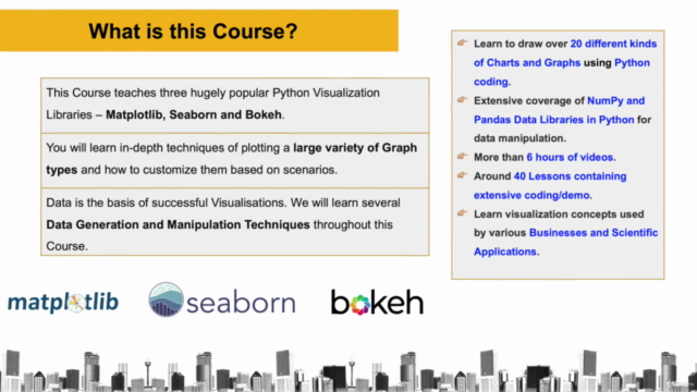
- Python Visualization Libraries Mastery: Get up to speed with Matplotlib, Seaborn, and Bokeh – the top libraries for creating compelling visualizations in Python.
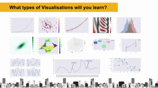
- Diverse Visualization Types: Explore more than 20 types of visualizations to represent different aspects of your data.
- Data Preparation Techniques: Learn how to transform raw data into a format that's ready for visual analysis using Numpy and Pandas.
- Advanced Charting & Customization: Understand the nuances of customizing charts, configuring them to your needs, and learning vectorization techniques for high-performance visualizations.
- Hands-On Code Demos: With each concept, see it in action through comprehensive code demonstrations.
- Deep Dives into Visualizations: Go beyond the basics with in-depth explorations of advanced customizations.
- Effective Learning: Reinforce your knowledge with logical placements of quizzes throughout the course.
🛠️ Key Features:
- Real-World Applications: Apply EDA techniques to real-life, business scenarios.
- In-Depth Analytics: Learn how to perform data analytics that pave the way from data to insightful visualizations.
- Interactive Learning: Engage with the material through downloadable code resources provided in each lecture for you to experiment with.
- Comprehensive Coverage: From foundational techniques to advanced customizations, this course has it all!
💡 Additional Resources:
- Downloadable Code: All the code used in the lectures is available as downloadable resources to assist your learning journey.
Join us and transform the way you visualize data! Enroll now and become a master of Python Visualizations with Matplotlib, Seaborn, and Bokeh. Let's make your data come alive and tell its story! 📈🚀
Course Gallery


Loading charts...
Related Topics
273812
udemy ID
03/08/2014
course created date
28/06/2021
course indexed date
ANUBHAV JAIN
course submited by