Microsoft Excel: Pivot Tables to Dashboard- Beginner's Guide

Why take this course?
📘 Course Title: Microsoft Excel: Pivot Tables to Dashboard - Beginner's Guide
Course Headline: Unlock the Power of Data with Microsoft Excel Pivot Tables and Dashboards! 🚀
Course Description:
Are you ready to transform the way you handle data in Microsoft Excel? Our comprehensive beginner's guide is designed to demystify Pivot Tables, making them accessible for anyone – no matter your current skill level. 🛠️
Pivot Tables are a game-changer for data analysis, offering a straightforward way to summarize and analyze large amounts of data. Whether you're in Marketing, Finance, HR, Supply Chain, or any field that relies on data-driven decision-making, mastering Pivot Tables will elevate your analytical prowess.
In today’s competitive environment, analytical skills coupled with the ability to summarize and visualize data are invaluable. Our course focuses on these skills, ensuring you can navigate complex datasets with ease and confidence. 💼
We understand that Pivot Tables might seem daunting at first glance, but fear not! Our simple structured step-by-step tutorials will guide you from zero to designing your own dynamic dashboards in a few short hours. With bite-sized lectures, each ranging from 3 to 8 minutes, you can manage your time efficiently and revisit topics at your convenience.
This course is tailored for absolute beginners, ensuring that no prior knowledge of Pivot Tables is required. Here's what we'll cover:
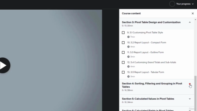
- Anatomy of Pivot Tables: Understanding the components and how they work together.
- Handling Continuous Updates in Source Data: Learning how to keep your Pivot Table up-to-date without starting from scratch.
- Customizing Your Pivot Tables: Personalizing your Pivot Tables for better clarity and insight.
- Sorting and Filtering with Pivot Tables: Streamlining your data to focus on what's important.
- Creating Calculated Fields and Calculated Items: Diving into the advanced functionalities of Pivot Tables.
- Pivot Charts, Slicers, and Timelines: Visualizing your data with interactive charts and tools.
- Conditional Formatting: Highlighting important data points to aid in analysis.
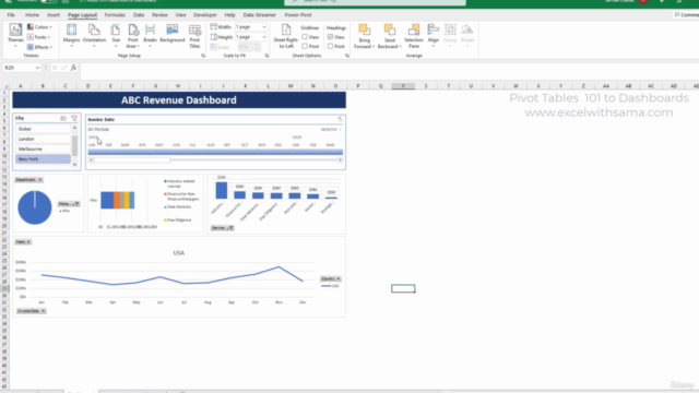
- Construct Your First Interactive User-Friendly Dashboard: Combining all the elements learned for a powerful end result.
By enrolling in this course, you'll have access to downloadable materials to work alongside the tutorials and solidify your newfound skills. Say goodbye to endless YouTube searches that lead to unrelated content – this course is your direct path to creating dynamic dashboards. 🎓
Enrollment Details:
- Course Duration: Learn at your own pace with lifetime access to course materials.
- Format: Engaging video tutorials, downloadable resources, and hands-on practice exercises.
- Instructor: Guided by Sama Sadat, an expert in Excel training.
Take the first step towards becoming a data analysis guru. Enroll now and transform the way you handle and interpret data with Microsoft Excel's Pivot Tables and Dashboards! 🌟
Instructor's Note:
I'm excited to welcome you to this journey of discovery and efficiency with Microsoft Excel. Your decision to enroll in this course is the first step towards mastering one of the most powerful tools for data analysis. I look forward to guiding you through this transformative experience and can't wait to see the incredible dashboards you'll create. 💻✨
Let's get started!
- Sama Sadat
Course Gallery


Loading charts...