Practical CSS3 Flexbox Media Queries & CSS Grid Mastery

Why take this course?
🚀 [Practical CSS3 Flexbox, Media Queries & CSS Grid Mastery] 🎓
Course Headline: Unleash the full potential of responsive web design with a deep dive into CSS3's most powerful features, including Flexbox, Media Queries, and CSS Grid, coupled with practical knowledge of Git and Github.
Course Description:
Embark on a journey to master the art of building responsive, adaptable websites using the latest in CSS3. This comprehensive course is designed to take you from novice to expert, guiding you through every nuance of Flexbox, Media Queries, and CSS Grid with real-world examples and hands-on exercises. You'll learn how to create versatile layouts that look stunning on any device, and you'll also get up to speed with the essential tools for version control using Git and Github.
Course Overview:
🛠️ Getting Started: Tools & Setup
- 1.1: Install VS Code and Server extensions for a seamless coding experience.
- 1.2: Introduction to Flexbox – the modern way to create flexible, responsive designs.
- 1.3: Setting up your project files:
index.htmlandstyle.css. - 1.4: Resetting margins, paddings, and the box-sizing for a solid foundation.
- 1.5-1.7: Styling boxes like a pro, with a focus on layout organization.
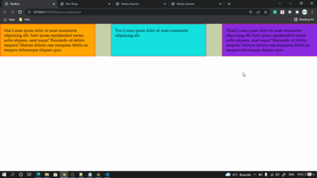
- 1.8: Mastering the Flex growth and shrink properties to achieve fluid designs.
🎯 Deep Dive into Flexbox
- 2.1-2.4: Explore various justify content options to align your elements flawlessly.
- 2.5: Learn about the space distribution options:
space-aroundandspace-between.
👀 Leaving Floats Behind
- 3.1: Understand why floats are passé and how Flexbox is a superior alternative.
- 3.2-3.4: Aligning items with precision using Flexbox, including center alignment.
- 3.5: Discover the
flex-basisproperty and its impact on your layout.
📱 Embracing Responsive Design with Media Queries
- 4.1: Learn the fundamentals of responsive design and why it's crucial.
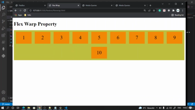
- 4.2-4.5: Master Flex Wrap for creating layouts that adapt to various screen sizes.
- 4.6: Enhance your layout's responsiveness with smart, context-aware design choices.
🌐 Understanding Responsiveness
- 1.1: Definition and importance of responsive web design.
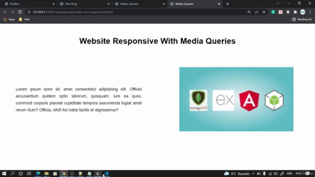
- 1.2: Recognize the pitfalls of non-responsive websites.
- 1.3-1.4: Create a non-responsive website skeleton for comparison purposes.
🔧 Version Control with Git and Github
- Creating a Github account to store your codebase.
- Installing Git Bash, your command-line interface for version control.
- Creating a Github token for secure access to your repositories.
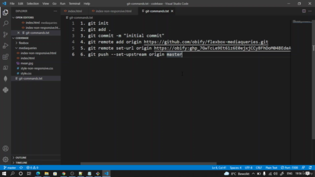
- Using Git commands like
git commitandgit pushto manage your code's lifecycle.
🎁 What You Will Receive:
- Complete source code for all projects to reinforce learning and kickstart your development.
By the end of this course, you'll have a robust understanding of CSS3's advanced features, the skills to build responsive websites that work on any device, and the ability to manage your code effectively with Git and Github. 🌟 Ready to elevate your web design and development skills? Enroll in "Practical CSS3 Flexbox, Media Queries & CSS Grid Mastery" today! 🖥️✨
Course Gallery


Loading charts...