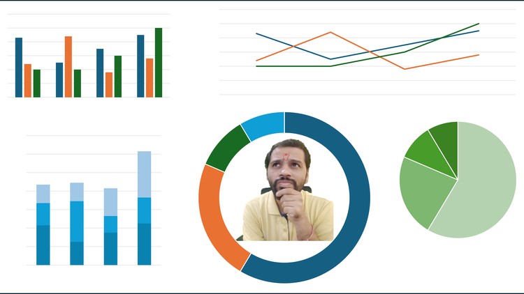
Learn the Art of Choosing the Right Graph

Why take this course?
🎉 Unlock the Power of Data Visualization with "Choosing the Right Graph"!
🔍 Course Title: Learn the Art of Choosing the Right Graph
🚀 Course Description: Are you ready to navigate through the maze of data visualization with confidence and precision? Say goodbye to the days of drowning in a sea of charts, feeling overwhelmed by the choices available. Our expert-led course, From Confusion to Clarity in Deciding Which Chart to Use, is your guide to mastering the art of choosing the perfect graph for every situation.
📊 What You'll Learn:
Understanding Graph Types:
- Bar Charts to present comparisons at a glance.
- Line Charts to show trends and movements over time.
- Pie Graphs to depict proportions of parts within a whole.
- Funnel Charts to illustrate stages in a process and their relative volumes.
Mastering the Science:
- Learn the strengths and limitations of each graph type.
- Decode the nuances that make a chart effective or misleading.
Critical Analysis Skills:
- Evaluate existing data visualizations with a critical eye.
- Identify when presentations may be leading you astray.
- Suggest alternative representations for better clarity and impact.
Communication Mastery:
- Present your data in a way that is both clear and compelling.
- Choose the right graph to tell your data's story effectively.
🎓 Why This Course?
Mahendra Ranacourse, an experienced instructor with firsthand knowledge of the common pitfalls in data visualization, will lead you through the intricacies of selecting the appropriate graph. He shares his own experience of misjudging the science behind data visualization and how this course can guide you to make informed decisions.
🕒 22 Minutes to Transform Your Skills: This concise yet comprehensive course is designed to fit into your busy schedule, offering a rapid learning path without sacrificing depth or clarity. In just 22 minutes, you'll gain the knowledge and confidence to choose the right graph for any scenario.
🌟 Key Takeaways:
- Learn the principles behind effective data visualization.
- Identify misleading graphs and understand how they can skew perception.
- Craft impactful presentations that truly communicate your message to the audience.
- Decide which graph type is best suited for the story you want to tell with your data.
🎯 Who This Course Is For:
- Data Analysts who wish to refine their visualization skills.
- Business Professionals looking to enhance their presentations with clear and compelling graphs.
- Academics who need to illustrate complex data in an accessible way.
- Anyone interested in the art and science of data visualization.
📆 Enroll Now and Transform Your Data into a Story! Don't let another confusing chart deter you from telling your story with clarity and precision. Enroll in "Learn the Art of Choosing the Right Graph" today and embark on your journey to becoming a data visualization pro! 📈✨
Course Gallery


Loading charts...