Microsoft Excel - Data Analysis with Excel Pivot Tables

Why take this course?
🚀 Course Title: Microsoft Excel - Data Analysis with Excel Pivot Tables 📊
💻 Master Microsoft Excel 2016 & Excel 2019 with Advanced Data Analysis Techniques!
Are you ready to unlock the full potential of your data and turn it into meaningful insights? With our comprehensive course, "Microsoft Excel - Excel Data Analysis and Visualization with Excel Pivot Tables, Excel Charts & Dashboards," you'll master the art of data analysis using Excel. This is not just another Excel course; it's a deep dive into the powerful features of Excel that will transform the way you handle and present your data!
Course Highlights:
-
🔍 Explore the Power of Pivot Tables: Learn to summarize, analyze, explore, and slave large datasets. Master the process of creating dynamic pivot tables that can respond to changes in your source data instantly.
-
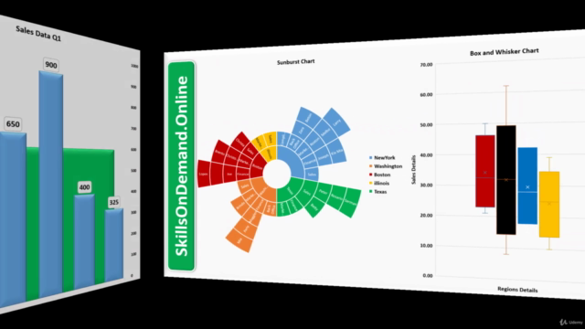
📈 Create Stunning Excel Charts & Graphs: Turn numerical data into powerful visual narratives with a variety of chart types. From simple bar charts to complex scatter plots, learn how to select the most appropriate chart type for your data.
-
📊 Design Your Own Dashboards: Learn to build interactive dashboards that bring together all aspects of Excel's data visualization tools in one cohesive and user-friendly interface. You'll create a 2D sales dashboard that will make complex data impressively simple.
-
🌐 Work with Advanced Formulas & Functions: Dive deep into the world of Excel's most powerful functions and formulas, which are crucial for efficient pivot table analysis.
What You Will Learn:
-
Pivot Table Mastery: Understand the top functions and formulas that will help you to effectively pivot your data sets for better insights.
-
Dynamic Charts & Graphs: Discover how to create 2D dynamic charts, graphs, or even 3D maps that will represent your data in a simplified manner.
-
Design & Style Techniques: Learn the ins and outs of designing, styling, and formatting aspects of Excel charts, graphs, and maps, including layouts, axes, grid lines, spark lines, trend lines, and error bars.
📚 Course Structure:
-
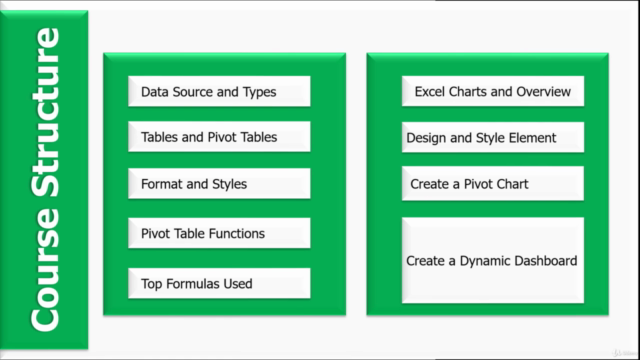
8+ Chapters: A structured approach to mastering pivot functions in Excel.
-
20+ Chart Types: From basic to advanced, we'll cover a wide range of chart types suitable for dynamic dashboards.
-
Top Formulas & Functions: Understand the most effective formulas and functions used in data analysis with Excel.
-
Design & Style Elements: Customize your visuals with layout, axes, grid lines, spark lines, trend lines, and error bars to make your data presentations stand out.
-
Capstone Project - 2D Dynamic Sales Dashboard: Apply everything you've learned in a real-world project that will serve as the pinnacle of your new Excel expertise.
🎓 Join Us on This Exciting Learning Journey!
With hands-on practice and expert guidance, you'll be well-equipped to analyze data like a pro and visualize it in a way that makes sense to anyone who views your dashboards. Whether you're an analyst, business professional, or simply someone who wants to enhance their Excel skills, this course is the perfect platform for learning and growth.
Enroll now and take your first step towards becoming an Excel guru! 🧙♂️✨
Course Gallery


Loading charts...