Introduction to Bootstrap 3

Why take this course?
🌟 Course Title: Introduction to Bootstrap 3
🚀 Course Headline: Dive into the World of Responsive Web Design with Bootstrap 3's Essential Features!
Introduction: Are you ready to embark on a journey into the realm of responsive web design? Whether you're a seasoned developer or just starting out, this course is your gateway to mastering Bootstrap 3 – one of the most popular and powerful front-end frameworks. 🖥️✨
Why Bootstrap 3?
- Compatibility: With support for all major browsers, you're guaranteed a consistent experience across the web.
- Responsiveness: Create designs that look stunning on desktops, tablets, and mobile phones with its flexible grid system.
- Efficiency: Cut down your development time with Bootstrap 3's pre-designed components and plugins.
Course Highlights:
- Comprehensive Overview: Understand the core structure of Bootstrap 3 and how it has evolved from its predecessor, Bootstrap 2.
- Grid System Explained: Learn how to use the grid system to build responsive layouts with ease.
- Responsive Utilities: Get to grips with utilities that help you create responsive designs without writing a line of media queries.
- Custom Mixins and Variables: Discover how to customize your Bootstrap for unique projects with mixins and variables.
What You'll Learn:
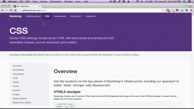
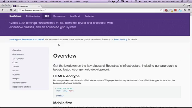
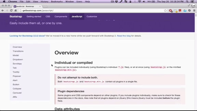
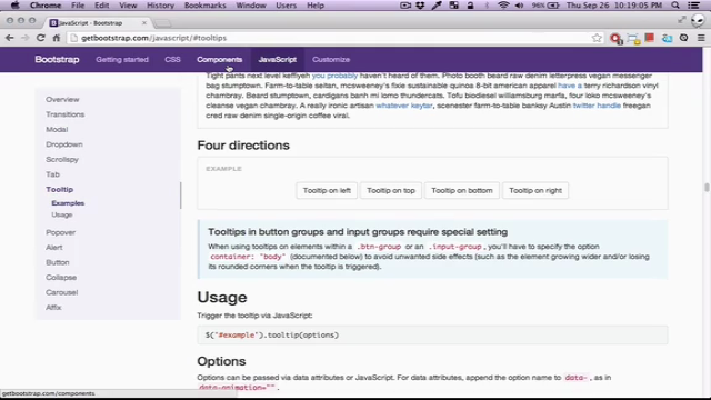
- Understanding the Documentation: While this course is a solid introduction, it's crucial to refer to the official Bootstrap 3 documentation for the most up-to-date information.
- Components Breakdown: We'll cover buttons, forms, navigation, and other essential components, all with real-world examples and sample code.
- Project Work: You'll work on live projects hosted on GitHub, giving you a hands-on experience with Bootstrap 3.
Course Structure:
-
Introduction to Bootstrap 3:
- What's new in Bootstrap 3 compared to Bootstrap 2
- The importance of responsive design and how Bootstrap 3 facilitates this
-
Exploring the Grid System:
- Understanding columns, rows, and nested grids
- Responsive design with the grid system
-
Responsive Utilities & Helper Classes:
- Aligning elements, showing/hiding content at different screen sizes
- Using helper classes for common responsive tasks
-
Custom Mixins and Variables:
- Overriding default styles and functions
- Creating a theme with custom variables
-
Bootstrap Components:
- Detailed tutorials on buttons, modals, navigation bars, and more
- Practical examples and coding exercises
What's Inside for You:
- Engaging video content that breaks down complex concepts into digestible lessons
- Code snippets and full-scale project examples
- Access to all course materials, including downloadable resources
- Lifetime access to course updates and additional resources
Get Started Today! With Bootstrap 3 under your belt, you'll be well-equipped to tackle any responsive design challenge. Join this course and begin your journey towards becoming a Bootstrap pro. Remember, the world of web development waits for no one, so let's get started! 🚀💻
Note: This course was published many years ago and while it provides an excellent foundation in Bootstrap 3, please ensure to consult with the latest documentation for any updates or changes to the framework. The journey into responsive web design is ever-evolving, and staying up-to-date is key to success. 📚✨
Course Gallery


Loading charts...