Excel and PowerBi for Data Visualization

Why take this course?
🎉 Master Data Visualization with Microsoft Excel and Power BI! answere: "Unlock the Secrets of Your Data with Our Comprehensive Course on Excel and Power BI for Data Visualization!"
📚 Course Overview:
Join us on a journey to transform your data into compelling stories that come to life through visualizations. This course is designed to elevate your skills in using Microsoft Excel and Power BI, turning you into a data visualization pro. Whether you're new to the world of spreadsheets or looking to expand your analytical toolkit, this course will guide you through every step of the way.
📈 What You'll Learn in Excel:
- Excel Fundamentals: Get comfortable with the interface and basic operations.
- Quick Access Toolbar customization
- Essential functions like SUM, MIN & MAX, AVERAGE, and AutoSum.
- Data modification techniques: Moving, Copying, Inserting, Deleting rows, Hiding, Unhiding, and Renaming sheets.
- Data Formatting: Font formatting, Creating styles, and Conditional formatting.
- Data Visualization with Charts:
- Crafting Excel Column and Pie charts.
- Understanding Pivot Tables: Creating, Modifying, Grouping, and Filtering.
- Mastering Data Analysis with Pivot Charts.
- Conditional functions like the IF function, Nesting functions, and Lookup functions (VLOOKUP, HLOOKUP, INDEX & MATCH).
📊 Power BI Essentials:
- Introduction to Power BI Desktop: Get acquainted with the tool and its interface.
- Connecting to various data sources.
- Establishing Table relationships and building a robust Data model.
- Data Analysis Expressions (DAX):
- Creating Calculated Columns and Measures.
- Using essential DAX functions like IF, AND, OR, CALCULATE, CALCULATE ALL, SUMX, and more.
- Visualization Techniques:
- Exploring the Report View and inserting Charts with a focus on Formatting and Filtering options.
- Working with advanced visuals like Matrix Visuals, Treemaps, Trend lines, and forecasting.
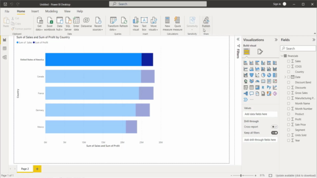
- Power BI Service: Learn how to manage roles in Power BI and publish your reports for stakeholders or team members.
🎓 Why Take This Course?
- Hands-On Learning: Engage with real-world scenarios and practice through exercises.
- Expert Guidance: Learn from experienced instructors who are experts in data visualization and business intelligence.
- Flexible Learning: Access course materials anytime, anywhere, fitting seamlessly into your schedule.
- Community of Learners: Connect with peers, share insights, and grow your professional network.
💡 By the end of this course, you will be able to:
- Confidently manipulate data in Excel for analysis and visualization.
- Utilize Power BI to create compelling reports and dashboards.
- Make informed business decisions based on data-driven insights.
Embark on your data visualization journey today and become a key player in turning raw numbers into stories that resonate. Enroll now and transform how you handle and present data! 🌟
Course Gallery


Loading charts...