Excel Pivot Tables Data Analysis Master Class

Why take this course?
Creating a Pareto Chart using Pivot Tables in Excel is certainly possible, and it can be a powerful way to analyze and visualize your data. Here's how you can do it step by step:
-
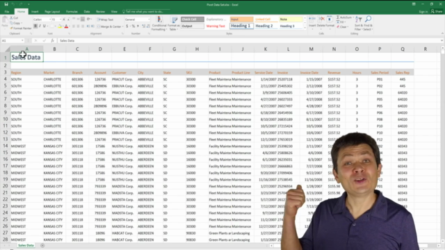
Prepare Your Data: Before you create a Pivot Table or a Pareto Chart, make sure your data is structured properly. Typically, for a Pareto Chart, you need two sets of data: the categories (like product names, task descriptions, etc.) and the corresponding values (like sales amounts, occurrences, etc.).
-
Create a Pivot Table:
- Select your dataset.
- Go to the "Insert" tab on the Ribbon.
- Click on "PivotTable."
- In the Create PivotTable dialog box, choose where you want the PivotTable to be placed (a new worksheet or a new sheet in a different workbook).
- Click "OK."
-
Arrange Your Pivot Table:
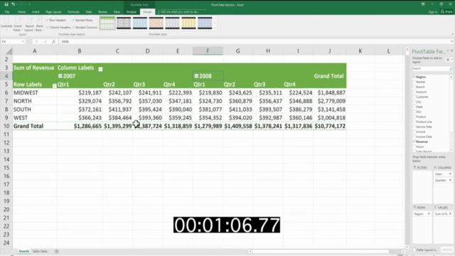
- Drag the category field into the Rows area of the PivotTable Fields pane.
- Drag the value field into the Values area below the Rows area.
- Ensure that the summary function is set to "Sum" or the appropriate aggregate function for your data.
-
Calculate the Relative Frequencies:
- You may need to calculate the relative frequency of each category (which is a measure of its contribution to the total). This can be done by creating a new column in your original dataset using a formula like
=1-($A2/$TotalSales)where$A2is the cell with the individual sale amount andTotalSalesis the sum of all sales. - Alternatively, you can add this calculation directly into the Pivot Table by adding another field with the formula applied to it.
- You may need to calculate the relative frequency of each category (which is a measure of its contribution to the total). This can be done by creating a new column in your original dataset using a formula like
-
Sort by Value:
- In the PivotTable, select the values you want to sort.
- Go to the "Data" tab on the Ribbon.
- Click on "Sort Largest to Smallest."
-
Convert to Pareto Chart:
- With your Pivot Table selected, go to the "Insert" tab.
- In the Charts group, click on "Pareto" (or "BAR + PIE" then select the Pareto option).
- Choose whether you want a 2D or 3D chart and then click "OK."
-
Format Your Pareto Chart:
- Adjust the titles, axis labels, and any other elements to make your Pareto Chart clear and easy to understand.
- You may need to filter the chart to only show the top 80% (or another percentage you're analyzing) if you want a true Pareto Chart with the "Cumulative Percent" line included.
-
Analyze the Data:
- The Pareto Chart will help you identify the most significant factors contributing to your overall total.
- You can focus on optimizing areas with the highest impact or consider removing items with the lowest significance.
Remember, the exact steps might vary slightly depending on the version of Excel you are using and the specific nature of your data. However, this general process should apply to most scenarios where you want to create a Pareto Chart using Pivot Tables in Excel.
Course Gallery


Loading charts...