Design Principles for Effective Dashboard Design
Why take this course?
🎓 Course Title: Design Principles for Effective Dashboard Design
🎯 Headline: Increase Engagement by Understanding the Psychology of Information Retrieval & 12 Actionable Improvements for Dashboards
🚀 Course Description:
Dive into the world of data visualization with our comprehensive course on "Design Principles for Effective Dashboard Design." In this expertly crafted program, you'll master the art of transforming complex data sets into intuitive and insightful dashboards that captivate your audience. With a focus on the psychology behind information retrieval, you'll learn how to design dashboards that not only present data clearly but also tell a compelling story.
What You'll Learn:
-
🕰️ The Importance of Dashboard Design: Discover why investing time in the design of your dashboards is crucial for communicating insights effectively.
-
🧠 Psychology of Information Retrieval: Explore how users perceive, process, and recall information, and how this knowledge can inform your design choices.
-
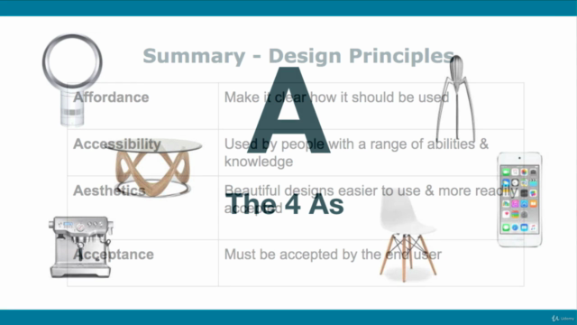
🎨 Core Design Principles: Get to grips with the four essential principles for UX design: Affordance, Aesthetics, Accessibility, and Acceptance.
-
⚙️ Actionable Tips: For each of the four design principles, you'll receive three key tips that are easy to implement and make a significant impact on your dashboard's effectiveness.
-
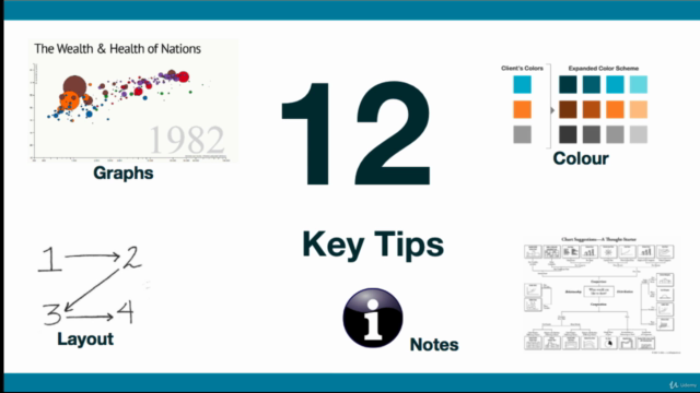
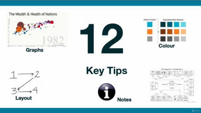
🛠️ 12 Key Actionable Ways: Learn twelve universal strategies you can apply to improve existing dashboards or incorporate into new designs, enhancing user engagement across the board.
Who This Course Is For:
This course is tailored for:
- Analysts and users who are creating dashboards for end-users.
- Managers of Analysts who want to oversee the design process more effectively.
- Users who interact with dashboards created by Analysts and seek to understand best practices in dashboard design.
🛠️ Universal Design Principles:
Whether you're using Tableau, Power BI, Google Data Studio, or any other Business Intelligence tool, these principles are not tool-specific—they're universal. This course will empower you with timeless design strategies that can be seamlessly integrated into your workflow regardless of the tools at your disposal.
Join Annabel Lyle, a seasoned expert in user experience and dashboard design, to transform your approach to data visualization. Enroll now to elevate your dashboards from good to great, turning data into a story that resonates with your audience and drives actionable insights. 📊🎬
Don't miss this opportunity to enhance your skills and make a significant impact on how data is interpreted and utilized within your organization. Let's embark on this journey to design dashboards that not only look great but also deliver meaningful information in a user-friendly and accessible way. Enroll today!
Course Gallery
Loading charts...
Comidoc Review
Our Verdict
This course on Design Principles for Effective Dashboard Design offers valuable insights and practical tips for learners at all levels of dashboard design experience. Though there is room for improvement in providing downloadable resources and updated examples, the strong emphasis on user behavior and engaging presentation format contribute to a positive overall learning experience. With a focus on enhancing data visualization and information retrieval techniques, this one-hour course can serve as an actionable starting point for improving your own dashboard design skills.
What We Liked
- Comprehensive coverage of dashboard design principles, including key considerations and tips for ensuring visual appeal and functionality.
- High-quality information provided in an engaging and easy-to-follow format, with relevant examples to illustrate concepts.
- Applicable to both beginners and experienced professionals, with practical examples that can be applied directly to dashboard design projects.
- Strong emphasis on the psychological aspects of information retrieval, helping learners understand how to craft more effective visuals and reports.
Potential Drawbacks
- Lack of depth in some areas, with only basic principles covered in a one-hour course format.
- Some outdated examples used in 2018 may not reflect current best practices or latest market updates in dashboard design.
- Missing links and resources promised within the course, as well as an overall lack of downloadable material for review.
- No handout or PowerPoint summarization provided by the instructor, making it difficult to review key points without rewatching videos.