DAX Dashboard Design - 10 Easy Steps

Why take this course?
🌟 DAX Dashboard Design – 10 Easy Steps 🌟
Are you ready to unlock the full potential of your Data Visualization skills? With the demand for data visualization alone projected to grow by an astonishing 44% and Pivot Table skills by a significant 34%, now is the time to master DAX, Power Pivot, and MS Excel!
🚀 IBM's Quant Crunch report projects that the number of jobs for all data professionals in the United States will increase by 15% by 2020, and this trend includes advanced analytical competencies like those you'll learn in this course.
📊 What You Will Learn:
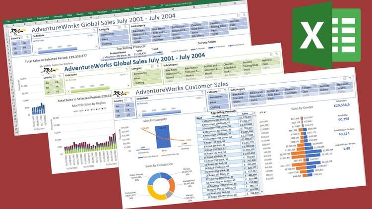
- How to create compelling, interactive dashboards using DAX and Power Pivot within Excel 2016 (with guidance for Excel 2010 & 2013 users).
- The essentials of data modeling and how to make your reports more dynamic.
- Techniques to turn your data into actionable insights through powerful visual storytelling.
🌍 Who Is This For?
- Employees aiming to get noticed with in-demand skills.
- Consultants and contractors looking to expand their service offerings.
- Career-driven individuals seeking to increase their pay or secure promotions and better contracts.
- Intermediate-level users of DAX, Power Pivot, and MS Excel who want to take their skills to the next level.
🎓 Your Instructor: Gilly brings years of experience and a clear understanding of how Power Pivot, Power Query, and Dax function to her teaching. Her engaging and simplistic approach ensures that you not only understand the concepts but also know how to apply them effectively in your data work and dashboards.
📘 Course Features:
- A comprehensive workbook for hands-on practice.
- Mini quizzes at the end of each chapter to reinforce learning.
- Practical exercises to solidify your understanding.
- Real-world examples for effective application of skills.
💬 What Past Students Say:
- "Good course - well thought out and presented... Highly recommended to those seeking to build effective dashboards in Excel." – BW
- "Enjoyable and useful content, geared for real-world application by an engaging tutor. Highly recommended!" – ST
- "Gilly’s DAX Dashboard Design course is excellent! I love the format and the guides. I will definitely sign up for more classes." – SD
- "I highly recommend Gilly's courses. Absolutely excellent content and examples!" – MB
📅 Course Format: This self-paced course includes video lectures, a detailed workbook, and real-world practice exercises. You can follow along using Excel 2016, but Gilly will also point out key differences for Excel 2010 & 2013 users.
💡 Take the Next Step: Are you ready to elevate your career with these in-demand skills? Click on the "TAKE THIS COURSE" button to embark on a journey that will transform how you approach data analysis and reporting. Don't miss out on this opportunity to future-proof your skill set!
Remember, if you have any questions or need further information, feel free to reach out via message or check out the FREE preview lectures to get a taste of what this course has to offer. Let's unlock the power of data together with DAX Dashboard Design – 10 Easy Steps! 🚀✨
Loading charts...