The CSS Flexbox Guide: Build 5 Real Flexible Projects!
Why take this course?
🌟 Course Title: The CSS Flexbox Guide: Build 5 Real Flexible Projects!
🚀 Course Headline: Dive into the World of Responsive Web Design with CSS3 Flexbox!
Unlock the Power of CSS Flexbox Today! 🎓
Are you ready to revolutionize your web layouts and create responsive designs with ease? Look no further! In this comprehensive course, "The CSS Flexbox Guide: Build 5 Real Flexible Projects," you will embark on a journey to master CSS3 Flexbox, the powerful tool that will transform your approach to web design.
What is CSS3 Flexbox? ❓
CSS Flexbox is a modern layout technique designed to simplify the process of creating complex layouts for any device or screen size. It's versatile, efficient, and can significantly improve your workflow in front-end development.
Course Breakdown:
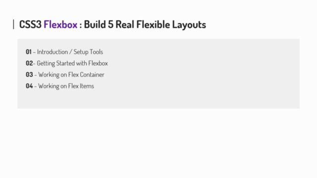
🧐 The Basics: We start with the fundamentals of Flexbox, covering what it is, why it's essential, and the main components that make up this layout system. You'll learn about browser support for Flexbox and how it fits into modern web design.
💪 Working with Containers and Items: Dive deep into the properties of flex containers and items, understanding sizing, flexibility, and alignment through practical coding examples. Learn the nuances between display: flex; and display: inline-flex; and how they can be used to your advantage.
🎉 Real-World Layouts: Once you've grasped the basics, we'll shift our focus to building real-world flexible projects. Here's what you can expect to create:
-
Centering with Flexbox: Master the art of centering content both horizontally and vertically with ease.
-
Flexible Image Grids: Build a responsive image grid that adapts to different screen sizes, ensuring your images look great at any size.
-
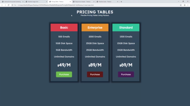
Pricing Tables: Design and align attractive pricing tables with Flexbox, demonstrating the power of this layout mode in structuring content.
-
Responsive Headers: Create a header for a webpage that looks sleek on both large and small screens, using Flexbox to ensure your design scales beautifully.
-
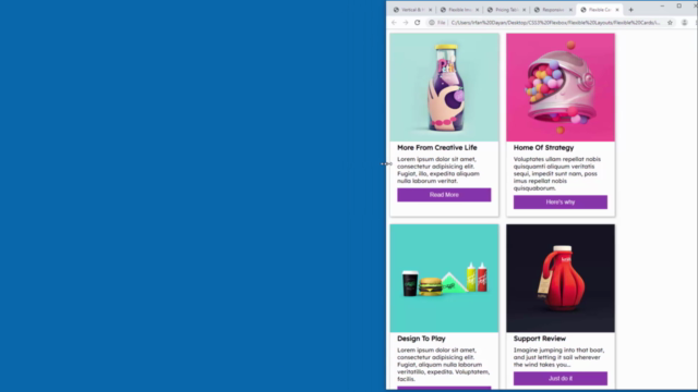
Flexible Cards: Construct flexible cards with equal heights that adapt gracefully to smaller screens, enhancing the user experience across all devices.
👩🏫 Learn by Doing: With each project, you'll apply what you've learned in a hands-on approach, ensuring you understand both the theory and practical application of Flexbox.
By the end of this course, you will:
- Have a solid understanding of CSS3 Flexbox and its properties.
- Be able to build complex layouts with less code.
- Feel confident in creating responsive designs that work across all devices.
- Have a portfolio of real-world projects to showcase your new skills.
Join us on this journey to master CSS Flexbox and take your web design skills to the next level! 🌟
Enroll now and become a Flexbox expert today! 🚀
Course Gallery
Loading charts...