Creating Bespoke Data Visualisations in Tableau - Part Two

Why take this course?
🎓 Unlock the Full Potential of Tableau: Creating Bespoke Data Visualizations in Tableau - Part Two 🌍
🚀 Why Join This Course? Whether you're an IT practitioner, a data scientist, or just someone who loves to delve into the world of data, Tableau Desktop is your ultimate tool for turning complex data into compelling visual stories. In this course, we're taking your data viz skills to the next level! If you've already mastered the basics from "Creating Bespoke Data Visualisations in Tableau - Part One" or if you're ready to leapfrog ahead with advanced techniques, this is where you want to be. 📈
🔍 What You'll Learn: This course is a deep dive into the art of crafting bespoke data visualisations in Tableau. We'll explore a series of tutorials that will elevate your ability to present data in innovative and insightful ways. Here's what you can expect:
-
Bespoke Point Charts: Discover new ways to represent point data, making it not just informative, but also visually captivating. 🎯
-
Bespoke Line Charts: Go beyond the traditional line graphs and learn how to use lines to tell a story that your audience will remember. 🧭
-
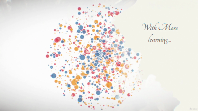
Bespoke Jitter Charts: Perfect for large datasets, these charts help you visualize data points scattered across a range without overcrowding. ✨
-
Bespoke Polygon Charts: Turn your data into polygons to highlight trends and patterns in your data in a way that's both unique and meaningful. 🏜️
-
Bespoke Miscellaneous Charts: Dive into a variety of other bespoke visualizations that will allow you to display your data in novel and impactful ways. 🎨
Course Structure: The course is divided into five comprehensive sections, each focusing on a different type of bespoke chart in Tableau. By the end of these tutorials, you'll have a robust set of skills to visualize almost any dataset imaginatively.
🎉 Who Is This For? This course is designed for anyone with an intermediate understanding of Tableau who wants to push their data visualization expertise to the limit. Whether you completed "Creating Bespoke Data Visualisations in Tableau - Part One" or have a solid grasp of customizing dashboards, this course will challenge and inspire you. 🤝
Your Instructor: Led by Toan Hoang, an experienced data visualization expert, this course promises to provide you with the knowledge and skills to create bespoke data visualizations that stand out in the crowded field of data analytics. With Toan's guidance, you'll learn not just how to use Tableau, but also how to think like a data storyteller. 📚
Join us on this journey to turn your data into stories that engage and inform. Enroll now to start mastering the art of bespoke data visualization in Tableau with "Creating Bespoke Data Visualisations in Tableau - Part Two." Your data awaits! 🌟
Course Gallery


Loading charts...