Create Analytics Dashboard with PowerBi and Tableau

Why take this course?
🚀 Master Data Visualization with Power BI and Tableau! 📊✨
Course Headline:
"Unlock the Secrets of Data with Analytics Dashboards in Power BI & Tableau!"
Course Description:
Embark on a journey to transform raw data into compelling visual narratives with our comprehensive online course, "Create Analytics Dashboard with PowerBi and Tableau". This course is meticulously designed to empower you with the skills to turn complex datasets into intuitive analytics dashboards that convey critical insights, trends, and outliers in business intelligence.
🔍 Key Course Highlights:
- In-depth Exploration: Dive deep into the world of Microsoft Power BI and Tableau, two industry giants for data analysis and visualization.
- Hands-On Learning: Create various types of charts, from simple to complex, and learn to extract meaningful insights from them.
- Customization Techniques: Discover how to tailor your charts with color, size, scale, text, and more to suit your data storytelling needs.
- Advanced Visualizations: Explore advanced chart types like Ribbon, Dual Axis, Butterfly charts, and many others.
- Practical Applications: Learn to create slicer filters, export data, and build interactive dashboards in Tableau that bring your data to life.
Course Structure: A Seamless Learning Journey
Power BI Modules:
Learn the fundamentals and beyond with our step-by-step approach to mastering Power BI's visualization capabilities. Cover a range of charts from the basics like Bar, Line, and Pie charts, to advanced ones such as Ribbon, Drill Down, Map Charts, and more. You'll also get hands-on practice with essential skills like creating slicers, exporting data, and integrating live web data.
✅ Power BI Chart Types Include:
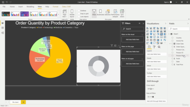
- Bar, Line, Pie, Ring, Tree Map charts
- Map Chart (Geospatial visualizations)
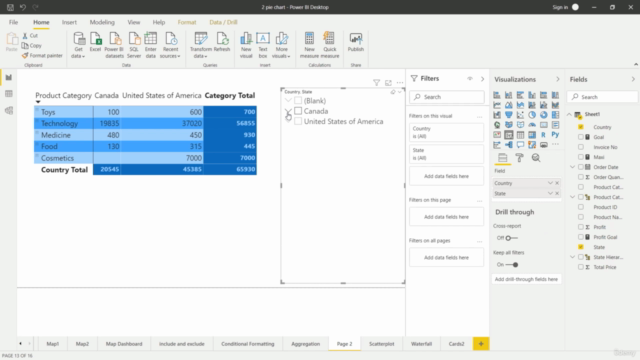
- Table and Matrix for structured data
- Ribbon Chart for comparing multiple segments
- Drill Down for detailed analysis
- Slicer Filter for dynamic filtering options
- Live web data integration
- CSV export functionality
Tableau Modules:
Transition to Tableau where you'll learn an array of chart types, from basic Bar and Pie charts to sophisticated visuals like Map Filters, Custom Filters, and Butterfly charts. You'll also gain expertise in creating multiple worksheets and dashboards that can narrate compelling stories using your data.
✅ Tableau Chart Types Include:
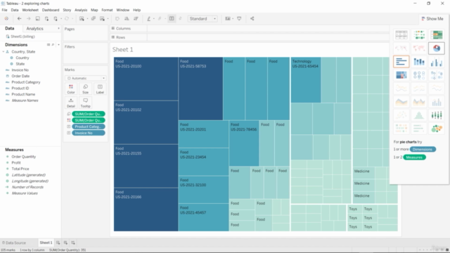
- Various types of Bar, Pie, Tree Map, Map, Bubble charts, etc.
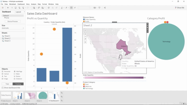
- Interactive Dual Axis Charts for comparative analysis
- Multiple worksheets and dashboards for complex narratives
- Map Filters and Custom Filters for granular data selection
- Butterfly chart for competitive analysis
- Funnel chart for process visualization
- Converting Measure to Dimension and vice versa for advanced analysis
Whether you're a complete beginner or looking to sharpen your skills, this course offers a balanced learning experience that will equip you with the tools and techniques to become an analytics dashboard wizard in Power BI and Tableau. 🧙♂️🚀
Enroll now to harness the power of data visualization and make a data-driven impact! 🎓💫
Course Gallery
Loading charts...