Colors for Data Science A-Z: Data Visualization Color Theory

Why take this course?
🎨 Colors for Data Science A-Z: Data Visualization Color Theory 🚀
Course Headline:
Master the Art of Visual Storytelling with Color!
Course Description:
Embark on a vibrant and immersive course that demystifies color theory and transforms your understanding of data visualization. Tailored for Data Scientists, Analysts, and enthusiasts alike, this A-Z guide will empower you to enhance the effectiveness of your visualizations and presentations through the strategic use of color. 🌈
Why Color Matters in Data Science 🤔
Imagine you've just concluded an intricate Analytics project. The data has been prepared, models have been built, and insights are abundant. But there's a critical next step: presenting your findings. This is where the true impact of your work can be lost or magnified. The key lies in the visual representation of your data.
- 🔍 Data Visualization: Not just a tool to present data, but a powerful means of storytelling and communication.
- 🎯 Impactful Presentations: Learn how to make your insights stand out with the right use of color.
- 🤝 Engaging Audiences: Capture attention and convey messages more effectively through visual appeal.
What You'll Learn in This Course:
Foundational Colour Knowledge:
- The origins and psychological effects of colors.
- How different colors can influence perception and emotion.
Advanced Visualization Techniques:
- Effective color combinations for clarity and impact.
- Best practices for visualizing different types of data (categorical, continuous, etc.).
Practical Applications in Data Science:
- Tools and software integrations for implementing color theory in your workflow.
- Real-world examples to inspire and guide your own projects.
Who This Course Is For:
Whether you're a beginner just starting out or a seasoned Data Scientist looking to refine your skills, this course is designed to enhance your visualization capabilities and presentations. It's perfect for:
- Data Analysts seeking to elevate their reports.
- Data Engineers wanting to make their dashboards pop.
- Business Intelligence Professionals aiming to captivate their audiences.
- Anyone interested in the intersection of art and science.
Your Journey with Kirill Eremenko:
Join Kirill Eremenko, a respected instructor known for his engaging teaching style and deep expertise in data visualization, on this transformative course. Together, you'll uncover the secrets of color theory and learn how to apply them effectively in your Data Science projects. 📈✨
Ready to Transform Your Data Visualizations?
Don't miss the opportunity to elevate your Data Science skills. Enroll now and let the power of color take your visualizations and presentations from ordinary to extraordinary! We can't wait to see you inside and witness the transformation firsthand. Let's create data visualizations that are not only insightful but also a feast for the eyes. 🌟
Kirill & Patrycja are excited to guide you through this enlightening course. Your journey towards becoming a master of data visualization starts here! Sign up today and paint your Data Science projects with the palette of success. 🖌️🚀
Course Gallery


Loading charts...
Comidoc Review
Our Verdict
This course offers valuable insights for data visualization enthusiasts seeking to enhance their understanding of color theory and practical applications. While the instructional style and production quality have room for improvement, the engaging and hands-on approach will benefit both beginners and intermediate learners looking to elevate their skills and create more impactful data visualizations.
What We Liked
- Covers both color theory and practical applications in data visualization
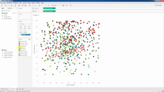
- Incorporates real-world data set example to demonstrate concepts
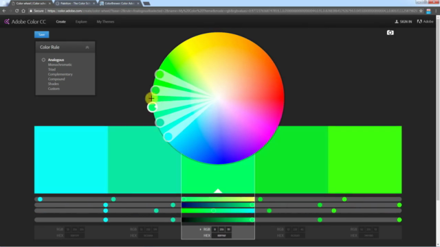
- Introduces helpful tools such as Adobe Color, Paletton, and ColorBrewer
- Clear explanations of fundamental color concepts like RGB vs CMYK, tints, shades, and tones
Potential Drawbacks
- Instructional style can be awkward and distracting at times
- Lacks in-depth discussion on color spaces (HSL vs. RGB) and CIE chromaticity diagram
- Limited exercises provided for choosing and using color schemes
- Occasional grammatical errors and less-than-ideal sound quality