Color Theory for Designers

Why take this course?
🎨 Color Theory for Designers: A Journey Through Hues with Sarah Parkinson-Howe 🎨
Course Headline: Get Inspired by Color for Graphic Design
Hey there, Design Enthusiast! 😊
I'm Sarah Parkinson-Howe, and I've spent nearly two decades as a seasoned Graphic Designer. Throughout my career, I've come to realize that understanding the language of color is not just an asset—it's a superpower in the world of design. In this course, I'm thrilled to pass on the wisdom I've accumulated about how to effectively use color to elevate your designs.
What You'll Learn:
- The Basics of the Color Wheel: We'll start at the foundational level, understanding how different colors interact with each other and the beauty that emerges from their relationships.
- Exploring Color Harmonies: From analogous to triadic, learn how to select harmonious color combinations that resonate with your audience and align with your design goals.
- The Psychology of Color in Branding: Discover how different colors can evoke various emotions and behaviors, influencing brand perception and identity.
- Mastering Color Systems: Dive into the practical aspects of working with RGB for web design, CMYK for print, and the iconic Pantone system for consistency across platforms.
Hands-On Experience:
- Engage with interactive class projects designed to sharpen your color selection skills.
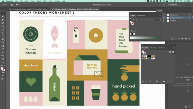
- Utilize powerful Adobe tools, including Adobe Illustrator and Adobe Color, to find inspiration and implement your newfound knowledge.
- Access a treasure trove of tips and resources that will guide you in selecting the perfect palettes for your designs.
By the End of This Course:
You'll feel empowered and confident when picking color schemes for your projects, armed with a solid understanding of color theory and its practical applications. You'll be able to create stunning, cohesive color combinations that not only look beautiful but also serve a purpose in your design narrative.
What Students Are Saying:
- "This class was really well organized & engaging! Plenty of examples, time for exercises, description of technical steps & downloadable resources. Would highly recommend!"
- "I love the class. This is an easy to follow guide to the fundamentals of color for illustrators and designers. I definitely recommend it. Thank you, Sarah!"
- “I recommend this course if someone is interested in starting Graphic Design. You learn the basics of color and how to use color in Adobe Illustrator.”
- “Great course for beginners and anyone that needs to revisit the color picking process. The steps are broken down into simple, easy to follow, instructions. I really needed to see the steps others walk through to create great color combinations. Every artist will do it differently but we all learn so much by understanding the processes that others use. I am glad I took this course—the project was an organized little task that articulates important parts of this process.”
Enroll Now and Transform Your Design Work with the Power of Color! 🌈
Let's embark on this colorful adventure together, and elevate your design skills to new heights. I can't wait to see what you'll create! 🖌️✨
Course Gallery


Loading charts...
Comidoc Review
Our Verdict
Dive into this comprehensive color theory course for graphic designers, boasting an engaging teaching style and solid exploration of various color systems. Despite minor issues with pacing, disconnect between theory and exercises, and outdated Adobe Illustrator content, the course effectively builds a foundation in color knowledge. However, those expecting explicit lessons on color psychology might be slightly disappointed.
What We Liked
- The course provides an in-depth exploration of color theory and its practical implementation in graphic design.
- Solid coverage of color systems, RGB, HEX, CMYK, and Pantone, enabling learners to work with various color formats.
- Learners appreciate the engaging presentation style, with simple and clear explanations accompanied by helpful visual illustrations.
- A project-based approach helps apply theoretical knowledge to real-world examples, which can be easily adapted to learners' projects.
- Suited for self-taught designers looking to reinforce their understanding of color theory fundamentals.
Potential Drawbacks
- The course could benefit from better alignment between theory explanations and exercises, making the connection between the two more explicit.
- Pacing varies throughout the course, with some lessons moving too slowly, especially when dealing with simple tasks like changing HEX values.
- Request for further exploration of creating a cohesive color palette, including elements such as light, dark, bright, and dull colors.
- Some learners have noted the outdated Adobe Illustrator content, specifically in regards to the Adobe Color panel and Pantone Library.
- A few students expressed disappointment that the course focused more on Illustrator than color psychology.