Creating professional business charts

Why take this course?
🎓 Course Title: Creating Professional Business Charts
🚀 Course Headline: Master the Art of Data Visualization with Our Expert-Led Course for Business Professionals!
🔥 Course Description:
Key Learnings:
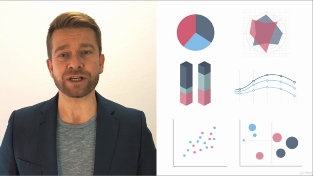
- Diverse Chart Mastery: Dive into the world of essential business and finance charts, with a focus on the ones most crucial for management and executive decision-making. You'll learn about a total of 15 key charts, ensuring you have all the tools you need without the need for further specialization.
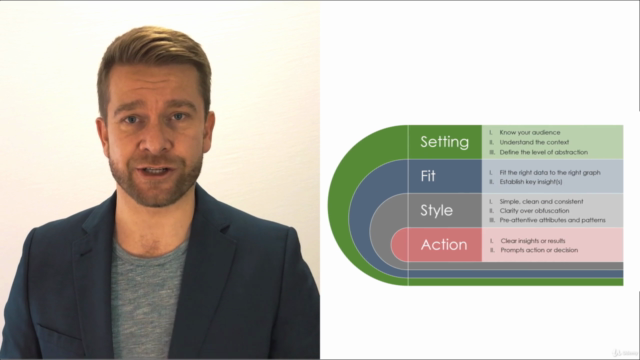
- Selecting the Right Chart: Learn the art of choosing the appropriate graph for your data, applying the best styles, and highlighting the most relevant insights, even in complex datasets.
- Step-by-Step Construction Guidance: With detailed instructions, you'll learn how to construct each chart from scratch, accompanied by valuable tips and tricks to format charts and structure underlying data effortlessly.
- Professional Standards: Elevate your charts to a professional standard that's ready for publication, using Excel's capabilities to their fullest potential. Every chart you create in this course is provided as a downloadable resource in a fully formed and publishable format.
Hands-On Learning:
- Real-World Applications: Understand not just the mechanics but also the practical applications of each graph/chart type within a business and finance setting.
- Versatile Data Handling: Learn how to handle both discrete and continuous data types, fitting them into various chart formats like column, bar, relative share, correlation, rating, ranking, and aggregation.
- From Basics to Advanced Techniques: Master well-known charts such as column and bar graphs, while also learning to construct lesser-known charts like Marimekko from the ground up in Excel with no external plugins required.
Charts Covered in this Course:
- 🏋️♂️ Stacked Column Charts
- 📈 Grouped Column Charts
- 🧮 Bar Charts
- 📊 Subcategory Variations on Bar/Column Charts
- 🔄 PivotChart Variation on Column Charts
- 🔀 Line Charts
- 📈 Combo Charts
- ⚪️ Scatterplots
- 🎉 Histograms (Pre and Post Excel 2016)
- 🍩 Doughnut Charts
- 🔗 Sunburst Charts
- 🌊 Waterfall Charts (Pre and Post Excel 2016)
- 📈 Bubble Charts
- 🎯 Radar Charts
- 🍫 Mekko Charts
- 🔥 Heatmaps
- ❌ (A gentle dissuasion from using) Pie Charts (We'll discuss why they're often not the best choice!)
Why Choose This Course?
This course is your gateway to creating professional, publication-ready charts with Excel. You'll learn not to settle for basic outputs but to go the extra mile in structuring and styling your charts to a professional business standard. With each chart you master, you're building a toolkit of data visualization skills that will set you apart as a professional who can make data meaningful and accessible to all stakeholders.
Join us now and take the first step towards becoming a data visualization expert! 🚀📈
Course Gallery


Loading charts...