Building Interactive Dashboards with Microsoft Power BI

Why take this course?
Course Title: Building Interactive Dashboards with Microsoft Power BI 🚀
Course Headline: 📊 Dive into Data: Learn to Create Captivating Dashboards with Microsoft Power BI for Unmatched Business Insight!
Unlock the Full Potential of Your Data with Microsoft Power BI
Course Description:
Are you overwhelmed by the deluge of data from various sources? Do you yearn to transform raw data into compelling stories that can drive business decisions? If your answer is a resounding "Yes," then this course is your gateway to mastering Microsoft Power BI and turning data complexity into simplicity. 🔍
What You'll Learn:
-
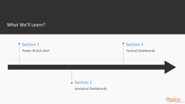
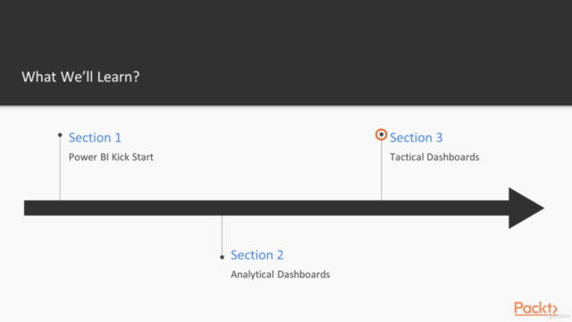
Dashboard Design Fundamentals: Understand the building blocks of interactive dashboards and how to create a simple yet functional dashboard that can provide valuable insights at a glance.
-
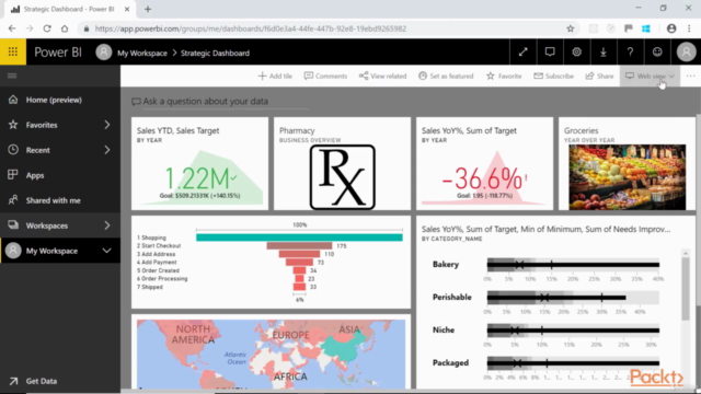
Interactive Elements: Discover how to present linked charts, Key Performance Indicators (KPIs), and other interactive elements that allow users to dive deeper into the data.
-
Real-World Applications: Work through examples suitable for publishing to different levels of stakeholders—from analysts up to executives. 📈
-
Storytelling with Data: Learn to tell stories with your data, guiding users through complex information in an understandable manner using Power BI's storytelling features.
-
Dashboard Styling for Publication: Get tips and tricks on how to style your dashboards effectively before publishing them for broader consumption. 🎨
By the end of this course, you’ll:
- Have a grasp of Microsoft Power BI's core features and functionalities.
- Be able to create interactive dashboards from multiple data sources.
- Understand how to communicate your findings through compelling visual stories.
- Feel confident in publishing professional-grade dashboards that can be used by decision-makers across various levels within an organization.
Instructor Corner:
About Peter MacMurchy 👨💻
With over 15 years of experience as a professional software developer, Peter MacMurchy has honed his expertise in User Experience (UX), User Interface (UI), and interactive data visualization tools. His passion for information visualization was sparked during his studies for an M.Sc. in Computer Science at the University of Calgary. Since then, Peter has continued to develop visualization and interactive software across various industries, including finance, film, energy, and more.
As a consultant at Uncharted, Peter assists clients in enhancing their data visualization capabilities. His hands-on experience and deep understanding of the tools at our disposal make him an ideal guide for this journey into the world of interactive dashboards with Microsoft Power BI. 🌟
Embark on a journey to transform your approach to data analysis and visualization with "Building Interactive Dashboards with Microsoft Power BI." Enroll now and take the first step towards becoming a data master storyteller! 📚✨
Course Gallery


Loading charts...