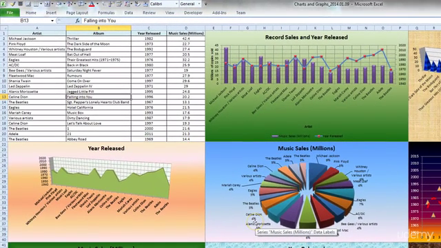
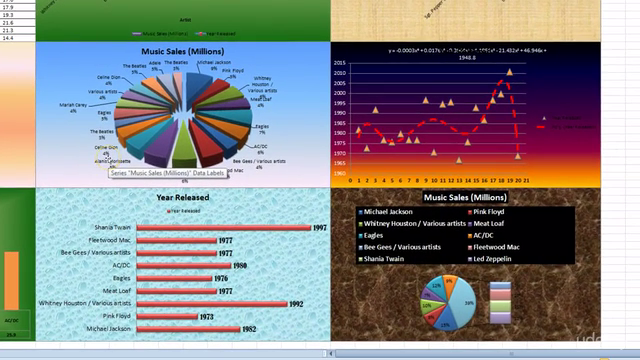
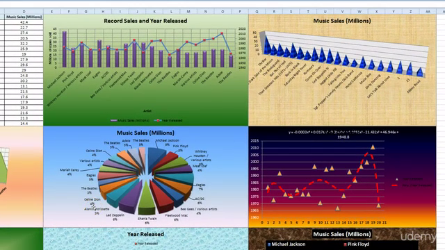
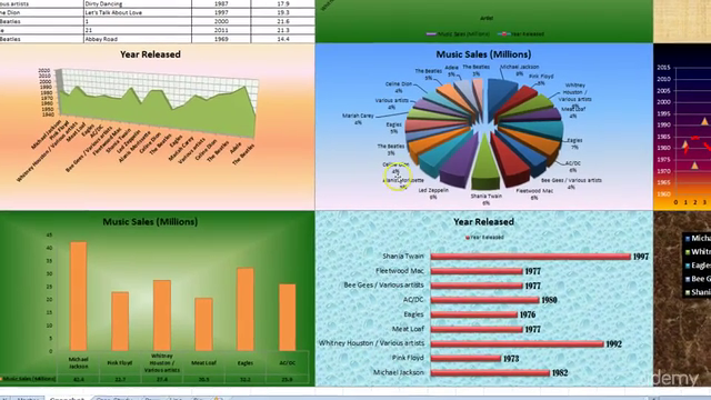
Microsoft Excel Line and Pie Graph Design and Styling

Why take this course?
🌟 Transform Data into Visuals with Excel Mastery! 📊
Course Title: Microsoft Excel Line and Pie Graph Design and Styling
Course Headline: Visualize data using vibrant charts and graphs! I'll teach you proper construction and styling using simple functions.
WHAT’S YOUR STORY?
Are you a business professional seeking to elevate your skills for that well-deserved pay rise or promotion? Or perhaps you're a fresh graduate with an ambition to fill up that resume and break into the job market? Maybe you've recently experienced a layoff, firing, or contract end?
If you've answered 'yes' to any of these scenarios, enhancing your "Expert Microsoft Office Skills" could be the game-changer you need. In today's volatile job market, up-skilling with in-demand abilities is not just an advantage; it's a necessity!
Why This Course?
- Industry-Relevant Skills: Learn the essentials of Excel charting that are highly sought after by employers.
- Real-World Applications: Apply your knowledge to real-world scenarios, making you job-market ready.
- Clear and Concise Instructions: No fluff – just the most effective techniques delivered in an easy-to-follow format.
Your Instructor: Jedidiah Berger (Member of the Udemy Council)
- Over 60,000 students mentored.
- Over 130,000 course enrollments.
- Over 5,000 positive reviews and counting!
- Co-Founder of Paperclip Learning, specializing in Microsoft Office training.
- A background in Aerospace Engineering, Database Design, and Business Analytics.
What You'll Learn:
Dive into the world of Excel charts with a comprehensive guide on how to:
- Construct Charts Effectively: Master the art of creating charts without the usual frustration.
- Add Titles and Labels: Learn to introduce your charts with style and precision.
- Style and Impact: Discover how to add titles, axes labels, legends, secondary axes, and multiple series.
- Design Enhancements: Apply design styles, format backgrounds, and apply graph textures to make your data stand out.
Course Format: Mini-Lessons for Maximum Impact
- Fast and Efficient Learning: Get straight to the point with no time wasted on unnecessary details.
- Detailed and Easy-to-Understand Instructions: Benefit from Jedidiah's clear direction and innovative teaching methods.
- Interactive and Engaging: With on-screen drawing and text magnification, you won't miss a thing.
Testimonials:
🚀 Yu Hui Jun Yu: "The courses are simply amazing and I can learn them rapidly. The hints presented were also very useful. I like the 'mini-lesson' format. Fast and efficient. The instructor's direction is very detailed and easy to understand. I can immediately start using this program. Thanks!"
🎓 Narayanan Krishnamoorthy: "Perfect and to the point...the instructor doesn’t waste time and gets to the point quickly!!!"
✨ Lala Darchinova: "I've been looking for this kind of course for ages! And finally, I find it. Short, comprehensive, and absolutely interesting! Thank you for the work you are doing."
🤓 Spencer Berkman: "Extremely knowledgeable and clear on instructions."
🌟 E Frank: "Simple to learn techniques and instructor made it all really easy. Thank you!"
🧠 Parth Gandhi: "I learned techniques in a very short time...no need to google and waste time finding the perfect approach."
Join Jedidiah Berger and take your Excel skills to the next level. Enroll now and start transforming your data into compelling visuals that will set you apart from the competition! 💻✨
Course Gallery


Loading charts...